How I Learned PHP (at WCSF)

PHP is like oxygen at a Wordcamp; it’s all over the place, in snippets, on slides, and within conversations. (Of course, PHP is also all over the place powering the web, too.)

During his State of the Word speech, Matt Mullenweg asked, “How many of you learned PHP from doing WordPress?” I’d say the majority of people, including him, raised hands. Of course, this raises questions of what things in PHP one learns from WordPress, and how does one keep learning more…

This helped inspire me to set up a new test site, howilearnedphp.com . I’ll use it to collect stories, pictures, and things about the continued learning of PHP. (It’s also for learning/testing the betas of BuddyPress/bbPress)

Presentations which helped me learn a little more about PHP and code development:

Some interesting links via the event twitterstream:

Plus, other code-heavy talks I didn’t see in person but am watching when the videos come out:

Posted in Web Design | Tagged , , | Comments Off on How I Learned PHP (at WCSF)

Thoughts on Editing

I believe that:

Editing is a craft and it’s fun.

Any writing can use more editing. Done, best, perfect, and the only way to say it are fictions; useful but precarious fictions.

If you’re looking for a writer, you probably need an editor. Writing is rewriting.

Writers are also editors, if they’re doing it right. Awkward writers become more sensitive editors for other people, more sensitive editors become more graceful writers. Fiction writers edit their characters’ lives and retell what they’ve heard. Chaucer was an editor trying to help his diverse characters get out their stories, but also making sure they got back on that road to Canterbury the next morning. Shakespeare improved-by-retelling stories from the Plutarch that he read in grammar school.

Editing comes in types, levels, stages, and waves. Levels of Edit is a term of art first used by the Jet Propulsion Lab in Pasadena. Levels of editing can include, adding some of my phrasing:

  • Developmental Editing, to develop an idea and find authors
  • Line Editing, to get a draft done and into the publishing process
  • Copyediting, to re-craft sentences and paragraphs
  • Repair/Literary Editing, to fix paragraphs and structure
  • Continuity Editing, to make consistent with a point of view or software version
  • Technical Review/Fact-Checking, to enforce accuracy
  • Stylistic Editing, to speak and sound smoothly in line with the publisher’s voice
  • Proofreading, to correct typos and grammar

Any writing needs more editors, more eyeballs, more editing styles, more editing personas. Sometimes from a large crew, sometimes from the same person. The words “Editing by Committee” slander the under-used practice of people working together.

Copyediting is different from proofreading. Editors and people who want editors fix onto the proofreading, which is so obvious and so quick. But many documents really need the less obvious copyediting. Copyediting works more and larger miracles than are dreamt of in the average universe. Rebuild entire sentences from scratch, reverse the whole order of a piece of writing, say more directly what the author intended but tangled up in the saying.

Strunk and White were right. Pay attention to their book. Get the illustrated version, too.

People who say “wordsmithing” instead of “editing” should remember that editing covers more than hammer taps.

Book that helped me when I took the class of the same name: Technical Editing: The Practical Guide for Editors and Writers.

If you use WordPress, use After the Deadline (AtD) as a plugin (also in Jetpack). FTW, AtD just red-lined wordsmithing for me!

Editing is a craft and it’s fun.

Posted in About | Comments Off on Thoughts on Editing

Tiny Tickets

My patch was committed for version 3.3, to fix a tiny typo I introduced in version 3.2. I think it helped to edit the title of the ticket, referring to Network Global Dashboard instead of Network Dash. Being patient didn’t hurt either. Not as quick as a similar typo (and the same typo creator) in #15870, which went 14 whole minutes from ticket creation to commit.

This help screen went from 49 word in WordPress 3.1 to 45 words in Trunk for 3.3. I messed with it in 3.2 not to shave off a few words but to make the flow of ideas cleaner. The typos show the risk of cleaning things up…  a risk worth taking.

New: The Right Now box provides the network administrator with links to the screens to either create a new site or user, or to search existing users and sites. Screens for Sites and Users are also accessible through the left-hand navigation in the Network Admin section.

Old: This screen provides the network administrator with links to the screens for Sites and Users to either create a new site or user, or to search existing users and sites, as well as Dashboard widgets. Those screens are also accessible through the left-hand navigation in the Network Admin section.

Posted in About, Web Design | Comments Off on Tiny Tickets

Small Words in Help Tabs

The WordPress help tabs rely on educated bets about what people will need at a quick glance, and where they will need it.

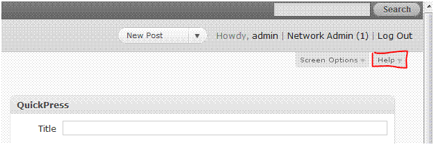
Top Secret: the help tabs are up here

To see this, look at the two admin screens where a new or newish user is most likely to use the contextual help for the first time. (Of course this is my personal guess; the other people who worked on the tabs could have other opinions…) These two tabs are also the ones most in danger of being too long or too dense.

The Dashboard screen appears when one first logs in; it’s like the home page for the Admin. The screen itself just contains seven boxes. But because it’s really the primary screen, we took the opportunity to mention many introductory things. We clued in people to the existence of helpful tips on each screen. We explained how the left-hand navigation menu works as well as the new Admin Bar above the Admin Header. I put in “new in 3.1” to reassure people of the fact that this content is being kept up to date.

The word “Box” replaced “Module” from 3.0 for the sake of brevity as well as polling well. “Faint separator lines” between named sections replaced “the separator lines between navigation sections that end in double arrowheads” because those lines were too faint to make out where the double arrowheads were. Also, between “Dashboard & Posts”/”Comments & Appearance” is clearer by being more specific than “navigation sections.”

New Post is the other screen where people will go frequently and first look for and at help. Using the “Screen Options tab to unhide more boxes” is a new phrasing because most of the boxes on this screen are now hidden by default. “Post Formats” is also new but this paragraph only appears in the tab if one’s theme enables this feature. The pointer to the full screen editor button in Visual mode is a new mention of an old (TinyMCE) feature that many people aren’t yet aware of when asking for an expansion of the writing box.

Of course, one can also expand that editor box by dragging the lower right corner of it, and its default size is slightly bigger because many of the other boxes are hidden by default. Just wasn’t room to add all that!

Here are screenshots of  Dashboard and New Post help tabs. I’m figuring out how to best frame and display samples of these with custom post types, using the Custom Post Type UI plugin.

Posted in About, Samples, Web Design | Comments Off on Small Words in Help Tabs

Pocket Philosophy of Contextual Help

Crafting varied, mostly small updates to the help tabs for WordPress 3.1 feels like a slow motion race against time. Iterations of the Beta version need to be in place to see what help text needs revising; any revising must be final before the string freeze in the Release Candidate. Wait to be ready to dash off blocks of text and patches. Yet, I think a philosophy of contextual help is evolving for these tabs, even with that measured urgency.

This is my personal list and a draft.

So what are the tabs looking like, and what do I hope for them, at their best? That they be:

  1. Accurate, up to date, direct, clear but also go beyond that.
  2. Crisp, engaging, friendly, light, funny, solid, personable.
  3. Short enough. I’m working on a landscape oriented laptop, and don’t want any tabs to go beyond the size of my own screen. Brevity rocks!
  4. Pointed and evocative rather than comprehensive, and that they have one, and sometimes several, specific links to the Codex, which is where the comprehensive lives and breathes.
  5. Anticipatory of the most likely problems for any given screen instead of exhaustively trying to list everything.
  6. Suggestive of doing and learning more, about themes, plugins, PHP, writing posts; they should plant ideas.
  7. Like a good meal, or more accurately a buffet with many choices. (They should also be hearty and nutritious!)
  8. Dynamically linked, to the theme one uses, to examples using one’s own domain, and eventually to more developed handbooks and pathways.

A link with more links: There are a lot of Contextual Help/Online Help writing people and resources out there.

Posted in Help Design, Samples, Web Design | Tagged , | Comments Off on Pocket Philosophy of Contextual Help

Lists about Writing (Lists)

Juxtapostion Studies:

How good are lists? See thoughts on how they can be good versus bad. Spoiler: often depends on the quality of the list.

Also lists on writing good blog posts (via) and good fiction. I think Kurt Vonnegut is using some of his irony when saying to hell with suspense while also advocating it. Do not fear the irony.

Posted in Writing & Editing | Tagged | Comments Off on Lists about Writing (Lists)

WordPress Help Tabs

I’m currently working on updating some help tabs for WordPress 3.1, about to go into Beta. See Trac Ticket #15346 (Contextual Help Tabs Cleanup) with patches I’ve submitted for individual dashboard screens.

For background on WordPress help tabs:

Posted in Help Design, Samples, Web Design | Tagged , , , | Comments Off on WordPress Help Tabs

My First Book


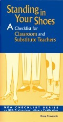
Standing in Your Shoes: A Checklist for Classroom and Substitute Teachers
by Doug Provencio

Standing in Your Shoes prepares educators for that inevitable day when a substitute teacher takes charge of the classroom. This unique book speaks to a dual audience, with a section for classroom teachers and a section for substitute teachers; and, it’s written so that both audiences can enjoy and benefit from reading about each other’s roles. Classroom teachers get tips on preparing for long-term vs. short-term substitutes, leaving good instructions and lesson plans for substitutes, preparing students for a substitute teacher, and anticipating last-minute emergencies. Substitute teachers learn what to do if lesson plans are skimpy, how to manage student behavior, how to work with different grade levels, and how to handle long-term assignments. Whether you’re filling some-one else’s shoes, or preparing someone to stand in yours, Standing in Your Shoes will help make the fit a lot easier.
National Education Association Members $5.50 Nonmembers $6.95 Item No. 2166-5-00
Order bulk quantities and save! A pack of 10 costs $30.00 — that’s just $4.00 per book.
To order, call toll free at 1-800-229-4200 or go to the NEA Bookstore.
Standing in Your Shoes Amazon page

Posted in Samples | Comments Off on My First Book

Theme choice

I’m currently using Carrington Blog, which has a layout structure I like, but will be switching to Twenty Ten once 3.0 is officially released. I’m using the 3.0 release candidates on my test sites, but this one drew the short straw for me to use as a sample of what 2.9 looks like.

I’m misusing Carrington as a finished theme when I think it’s really a theme framework. I had thought about Thematic, which is also a framework with maybe a more standard file structure. It also has some nice resources for modifying it, generally and using child themes.

Nothing against Carrington or Thematic; just don’t have the time right now for frameworks as I’m concentrating more on content and content types.

Posted in About | Comments Off on Theme choice

Video Redux

More on using videos for help and explanation.

Some examples:

Communicating user experience through video telling stories

Taking a cue from science fiction movies (Star Wars, Starship Troopers) using holograms of people sending messages, CNN used a holographic analyst on election night

How well does a 1930s short movie work as an online video?

Creative and innovative uses of online video

Working on getting the implementation part right:

Usability and interface design issues

In case you wondered, Why Do Adobe Flash Videos Slow Down?

To me, the very watchable WordPress.tv seems to have smoothed out such problems

FYI, people watch at all times, except during dinner: online video viewing has no ‘peak times’

Hybrid use of video with written materials or a personal touch:

Chrysler combines a dvd of longer explanations with a shorter than before car manual

A WordPress consultant points clients to WordPress.tv even while remaining their “central support mechanism”

Thought pieces

Sergey Brin on the potential of YouTube

The question of how videos are  like or unlike explanatory comics

Dealing, as a communicator, with the explosion of new media

Local online news video: what types of content work best (features, local, breaking rather than national news or talking heads)

Posted in Help Design, Software Tools | Tagged , | Comments Off on Video Redux